Lighting Matters
Remember a few years back everyone was fighting on the internet over whether that dress was blue & black or white & gold? That’s a great example of how lighting greatly affects your perception of color.
Perception of color varies from person to person. In that picture of the dress, we’re making assumptions about what lighting is in the space. Sunlight, dim light, fluorescent light, we don’t know!
As designers we have a few examples that we’ve witnessed firsthand on how our minds can trick us to drastically impact our view of the hue, texture, and feel of different tiles.
This lovely large-format tile at first came off as looking very cold. This project’s overarching theme aimed towards being modern, but we still wanted the space to feel inviting. You can see in the picture how the lighting brings out the warm tones in the tile
This beautiful tile’s color was labeled as “Living Green”. The sunlight makes it appear blue, however, once inside we can grasp why it was named that way.
This particular subway tile online mutes all the pieces’ defining features. You don’t see the actual texture or gloss that helps you judge whether or not it matches the look of your home.
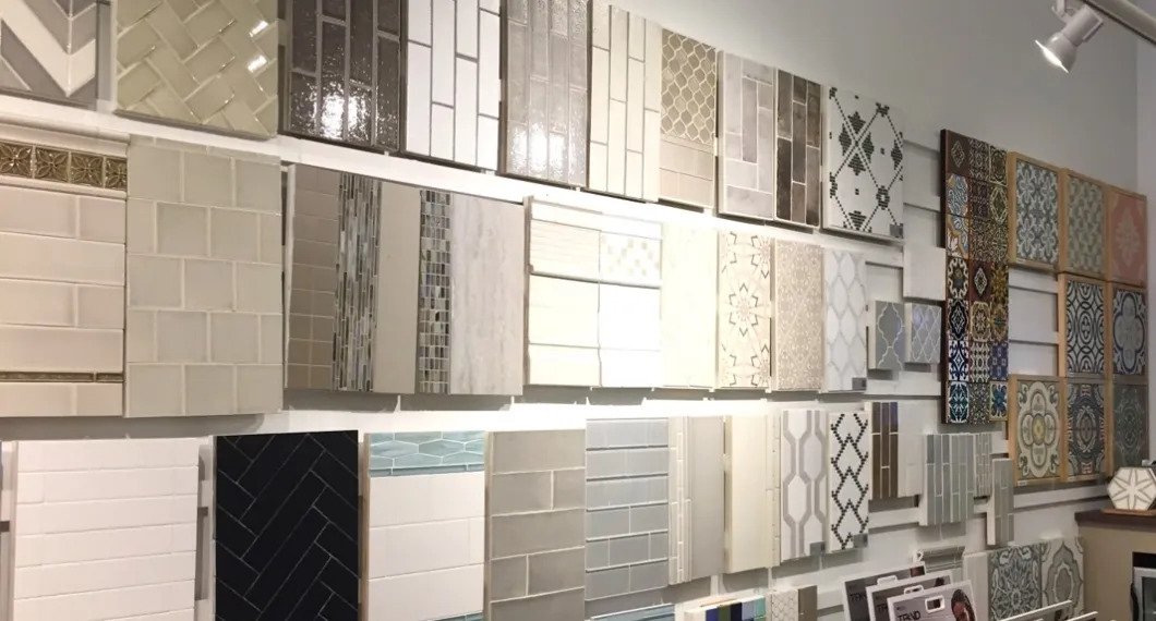
When designing a space, it’s important to see all selections in person. K-One Design & Build gathers the tile and flooring samples for you to see up close. It helps guide our decisions when choosing other elements for the project. Pictures online don’t always do justice because the perception of light is different. The physical piece will allow you to see how it will react once it’s underneath the lighting in your home. We understand it’s essential to your overall satisfaction with your project.